In light of Wandering Wednesday I wanted to share an amazing site with you all. I know often when I can't come up with the right words for journaling I enjoy using quotes of all kinds. This site is amazing. not only are there just great easy to find and access quotes but it also allows you to do a word search. Sooo say your art journal has bricks on it... or a stone wall you can type in brick or wall and it will give you quotes that use those words! how stinky nifty is that! So, when you have a moment feel free to go check it out.
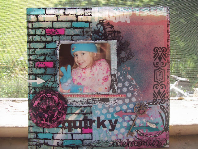
Sharing a few layouts I did last night. I'm liking them. Both took no time at all and yet still have their own components that well.... make me smile.
If you love the hand made paper flower that is showcased on he first layout stay tuned as Thursday it will be my tutorial for the week. It's much like the circle flowers you've seen in the past with my own twist to it. You can't tell in the picture but the black on it is NOT ink... and its shiny! Hee hee whats better than something shinny... I'll even show you how to make flowers that look like leather using this technique.
If you love the hand made paper flower that is showcased on he first layout stay tuned as Thursday it will be my tutorial for the week. It's much like the circle flowers you've seen in the past with my own twist to it. You can't tell in the picture but the black on it is NOT ink... and its shiny! Hee hee whats better than something shinny... I'll even show you how to make flowers that look like leather using this technique.
 |
| The spider webby lace there is something I've been wanting to play with but haven't found the right time. I like what it adds here. |
 |
| Layout showcasing my daughter. This layout was super simple and only took about 20 minutes which I adore. I used a lot of grungeboard here as I was showing someone how to paint and ink it. |
 |
| Alittle chicken wire here i picked up from a thrift store and painted white and love it. then a handmade sheer ribbon flower. |
 |
| Here I added some hidden journaling. It's a small notebook paper with a note to my daughter that someday she can unroll and read. |


Wow What adorable lay outs!
ReplyDelete