Okay, does this happen to anyone else but me. you find a really neat paper, like the 7-Gypsies paper below. And then one of two things happen it's too bold and bright or there's a large image on you have to work around in order to include it. I love this paper, because of the shoes and wanting to showcase the shoes. however, when buying it I didn't think about how it would limit my options of design. So this is what I do with papers that need tamed a bit.
I dedicated all yesterday to crafting and let me tell you it felt amazing! Hadn't done any layouts in a while that were nice and simple so these were alot of fun not to have too much "fuss" about them!
 |
| First I applied watered down Gesso to the entire paper. To make the images more so in the background then in the fore front. |
 |
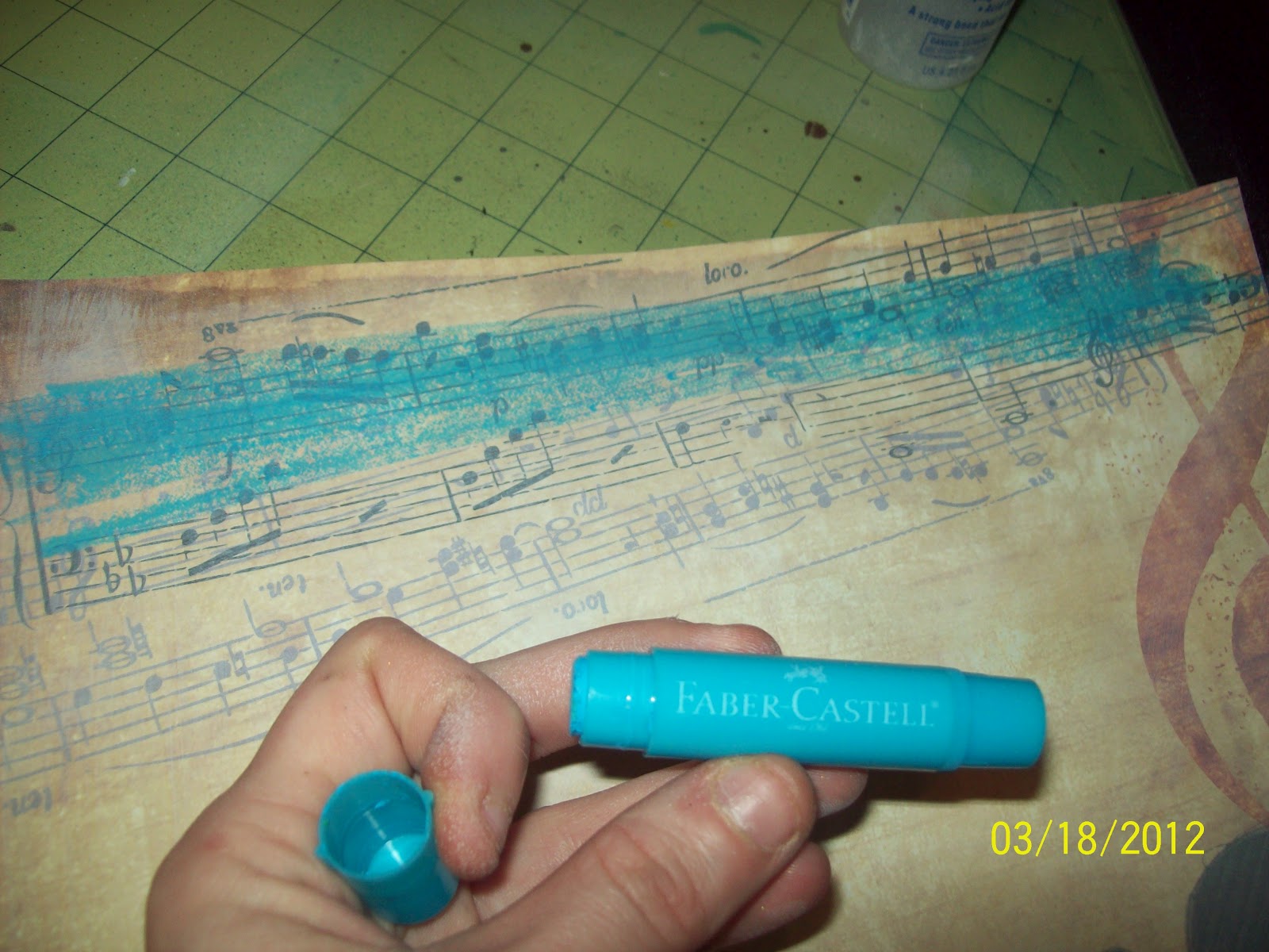
| I then applies some blue gelatto to the top and used it as a watercolor to tint the page unevenly. |
 |
| Alittle bit of bubble wrap followed by more Gesso. Like I said I wanted all of the elements there, but I didn't want them so bold and in your face. |


very very nice- love that blue gelato- I don't have any of those, yet!! I need to check them out!
ReplyDelete-k